


grendeljd
Member since: 2011Here is Scarecrow in his civilian attire.
These are very rough concept sketches only, so don't mind the bad proportions and fuzzy detail here & there. Most importantly, his face doesn't really represent a Jango clone yet - I doodled the first image while at work and had no immediate reference material for the face. For now I am just trying to nail down the look of his outfit & hairstyle. Weapons will also be better detailed in a final drawing.
I hope its obvious enough, I have drawn the thin-suit draped around his neck. I don't think it would be too large or baggy since it would be a tight fit to his head when pulled on. I made his undershirt kind of in the style of a padawan wrap, I may change that... I've also added knee-pad armour, I think he'd appreciate it doing the work he does [he may be kneeling down planting bombs in his civvies sometimes, not always when armoured up?]. And I hope the hairstyle works - I thought that since he is a clone, he'd be using some of that long hair to try and hide his features a bit, but I like the look of a loose top-drawn ponytail. And a bit of facial hair growth, too.
Because the character has special training in demolitions & equipment maintenance, I thought it appropriate for him to have multiple storage for tools & little parts etc, thus the backpack and clip on pouch belt. I am an Industrial Maintenance Electrician myself, and I always have a variety of tools stuffed in pockets while at work in addition to my tool pouch.
Tetsuoh, do you have something specific in mind for the Scythe symbol? I was thinking of incorporating it on the shoulder lapels of the jacket. I think I will be doing a second drawing of him in armor too, I need some ideas for the symbol on it.
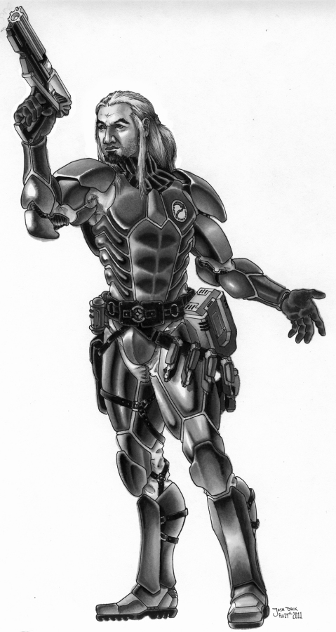
Feb 8th/2011 - added another rough concept sketch, this time for his composite armour suit.
Feb 9th/2011 - added final pencil drawing for Scarecrow in his Composite armour.
Feb 24th/2011 - added final marker rendering.
Mar 15th/2011 - deleted the last post [bad proportions!] and added a greyscale final marker version with his head fixed [I hope].
April 4th/2011 - added base color render.
April 9th 2012 - rendered hair in blonde, as he was meant to be.
Comments
I have always admired how meticulous you are when it comes to a project.
This is looking very interesting! Can't wait to see what you do with it!!
Wow. Oh my- just - wow. Holy crap, man.
Boshuda
Wow, looking good! It kind of reminds me of those great concept sketches from original trilogy! :)
Thanks, people!
@Dred, we always had the best times collaborating on projects because we were both very meticulous, I think.
@I.J. - thats high praise indeed, I don't think I am quite that good! I am certainly inspired more by older, hand drawn concept art than some of the modern digital concept work.
Another rough concept added of the composite armour - I also used some reference for Jango's face in this one. Did I fail?
Very Very Nice!
Ya know I wondered if anyone would consider taking your standard ex-clone trooper sketch.
I'm really glad you did.
Thanks much grendel.
~Tet
Most of your thoughts on the subject were spot on, ie he has a goatee to help hide his face.
he usually has belt pouches and a side pouch (armored) for his explosive charges.
The symbol is the traditional grim reaper scythe with the blade forming a circle edge symbol and a curved handle. The symbol actually has wording forming the rest of the circle but that would probably be hard to draw. The position you have for in the armor picture is spot on.
Logo Created in PSP
Those of you not quite so "Geek" As me, It says "And Lo, Shall My Enemies Fall Before Me."
Its the vow he took to avenge his brothers after the armorsmith messed it up during the paint job...
Hey Tetsuoh!
Glad I heard from you before getting too far - i am in the middle of doing a final pencil of Scarecrow in his armor. I'll be sure to give him a goatee instead of the scruffy beard [though I think a bit of stubble suits him too]. Should it be short or long?
Also, I have already drawn in the pouches and explosives around his waist area in the final drawing - do you have a problem with any of the details in the rough sketch? I can easily change the pouch on his left hip to look more armoured and a bit bigger. I'd like to keep the lower belt [on his left] of mini-explosive type devices if I may, it adds to the drawing composition greatly.
Thanks for the image of the scythe symbol - I will add the writing as best as I am able, its gonna be pretty small. Keep an eye out, I will try to get the final pencils posted here asap! I may even do a second image of him in his civvies, I am having a ton of fun with the character.
Final pencil drawing is up - next stage is inks & marker render, then colours... Tetsuoh, note the change to the side belt pouch, the scythe symbol & the addition of a goatee. Anybody see any major flaws in the piece so far? I am hoping the DC-15s blaster is not out of proportion [too large?], and I am thinking maybe his left hand is a tad too small... I think I captured Jango Fett's cloned face ok though... feedback is more than welcome!
Hey Gren.. I'm not an artist at all.. but his stomache area seems way smaller than it should be, compared to his chest and waist. Just a thought.
Love the picture though.
I hope I am not over-doing the progress pics, I am still just a wee bit excited to be doing this! I had to work over 70hrs last week and it killed the art buzz I've had going with this guy. Last night I finally got back to it a bit and started the marker rendering. I've fixed the left hand, left foot and thanks for the feedback Xan, I made a slight adjustment to the width of his waist area. I was getting carried away with making him look slim in the Rebel Special Forces armour since it's so form fitting...
! ! ! ! !
Lookin' good Bud. My wife said the same thing as Xan did about the waist when I showed her the progress the other day. Good job on the recovery!
I don't think you are over-doing the progress pics. Whatever keeps you motivated. For me, I find posting progress pics actually saps my will to complete the task...so I generally don't do it, but it seems to be keeping you on track.
If I could say, I really think the neck is a little too long. Other then that I think this is coming along VERY well.
Eclipse
Lookin good, man!!
Looking very nice - sorry I don't comment often - I have internet trouble atm so getting on to check up on things is a bit hard.
uh-oh. Hope that neck thing isn't too bad - I wonder if it's because of the long lines in that neck armour, maybe causing it to look exaggerated?
I should have a final marker render up this week.
Final marker rendering now up, next on to the colour stage.
I just hope the coloring doesn't take away from the drawing.. it looks great man.
I think it's the placement of the head. Visually looking at the left shoulder all the way to the base of the skull, a line we can easily follow, I think it just looks too long. If the head were physically pulled back towards the center/left-side-of-body I think it would fix up the perception.
Eclipse
I totally agree, Eclipse. In fact I am thinking the head is slightly too large as well. I am going to attempt a digital edit before colouring, which will be a pain considering the long hair dangling in front...
OK, I have been busy for the last few weeks, working overtime and trying to do some illustration work that came up on the side [>ahem< paying illustration work, that kinda has to take priority]. Sorry for the delay, Tetsuoh - hope to get at the colouring soon and finish this guy off for you! Any feedback on my fix to Scarecrows head would be appreciated, fellow Swaggers!
Looks MUCH better.
Eclipse
I notice it's signed...does that mean it's complete? Or is this going to be a colour?
Ok, good - thanks Eclipse!
@Dred - no, it isn't complete yet. I signed it when I inked it as is my habit. I am trying to get it coloured as we speak, having a rough go in photoshop. I am also trying to work on that Defiance cover you've seen in photoshop too. Eeesh.
Alright, at last got some flat base colours added to this guy. I've left the badge uncoloured for now - Tet, let me know what colour you want it to be if you can. Note the brown hair, thats just a base, it will be blonde by the end.
NICE work! I'll say the colours are far exceeding what I expected after all that marker rendering! COOLNESS!
The Badge is fine as is unless you want to make the background a slightly lighter shade of green than the armor shell.
I gotta say - I love it. And I cannot thank you enough for all the hard work.
Its amazing to show someone your work and get to say - "Meet the Scarecrow. Btw - expect explosions."
Jeez - its been a year since I last played with this image. Do I ever feel like a jerk, and a giant dork. I just wanted to get a new update out, in this one I finally had a bit of time to render up the hair in blonde as he should be per the request. I kept his eyebrows & goatee brown on purpose - I can't picture him taking time to keep re-dying facial growth. More to come.
Let me just say that you are in no way a jerk! However long it takes you're still doing something totally off your own back for someone else, and there's nothing jerky or dorky about that. Not to mention that a piece with THIS much insane attention to detail is worth waiting a year for.
Very nicely done. I like how he grew his hair out and colored it to change his "clone" appearance, I like your finished piece very much. =D
So when are we seeing some more from you??? Love your work.
Added a pic of the shamefully simple digital colouring I did under the original marker drawing, just for fun :)
@Casca - thanks!! Hopefully I will be able to get more done around here - got a lot going on on the side, though.
The final pic can be viewed here: http://www.swagonline.com/node/6722